Puig Unveils New Company Logo Symbolizing a Fusion of Heritage and Innovation
THE WHAT? Puig, a venerable name in the beauty and fashion industry, has introduced a new company logo that honors its storied past while looking forward to a vibrant future. This redesign, in collaboration with the French art and design agency M/M (Paris), encapsulates Puig’s dedication to creativity and its core cultural values.
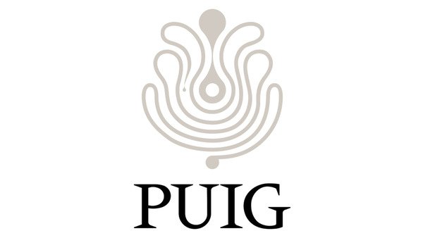
THE DETAILS The logo redesign builds on the foundational work of Swiss designer Yves Zimmerman, incorporating a bespoke typeface named Paralelo. This typeface is inspired by Méridien, a 1955 creation by Adrian Frutiger, which Zimmerman initially adapted for Puig over half a century ago. Complementing this typeface is a new symbol, reflective of an infinite line of creativity inspired by a Miró painting, and subtly nodding to Puig’s 1970s logotype also crafted by Zimmerman.
THE WHY? Marc Puig, Chairman and CEO of Puig, stated that this new visual identity aims to reinforce the company’s ethos as a “Home of Creativity.” The logo is designed to reflect Puig’s dual commitment to tradition and forward-thinking innovation, serving as a beacon for its nurturing environment where brands thrive, people grow, and bold ideas are celebrated. This transformational change underscores Puig’s strategic direction, blending historical elements with modern design principles.
The post Puig Unveils New Company Logo Symbolizing a Fusion of Heritage and Innovation appeared first on Global Cosmetics News.